Seriously, Why Feet?
May. 8th, 2013 11:46 amHere's an entertaining experiment: Maureen Johnson asked her Twitter followers to reimagine book covers after swapping the authors' genders. Some of them are painfully funny.
Of course, this just brings home to me that most book covers, aside from being gendered as FUCK, are also terrible. I remember getting fairly grumpy as I shelved books at the library: all the male authors got Jackson Pollock ink splats, and the female authors got random fruit, random flowers, or, for some reason, feet. And then of course there's the Angsty YA: dudes get monochromatic silhouettes, and the ladies get monochromatic greyscale soft-focus girls looking thoughtfully away, possibly at the wind machine that seems to be blowing their hair all over the place.
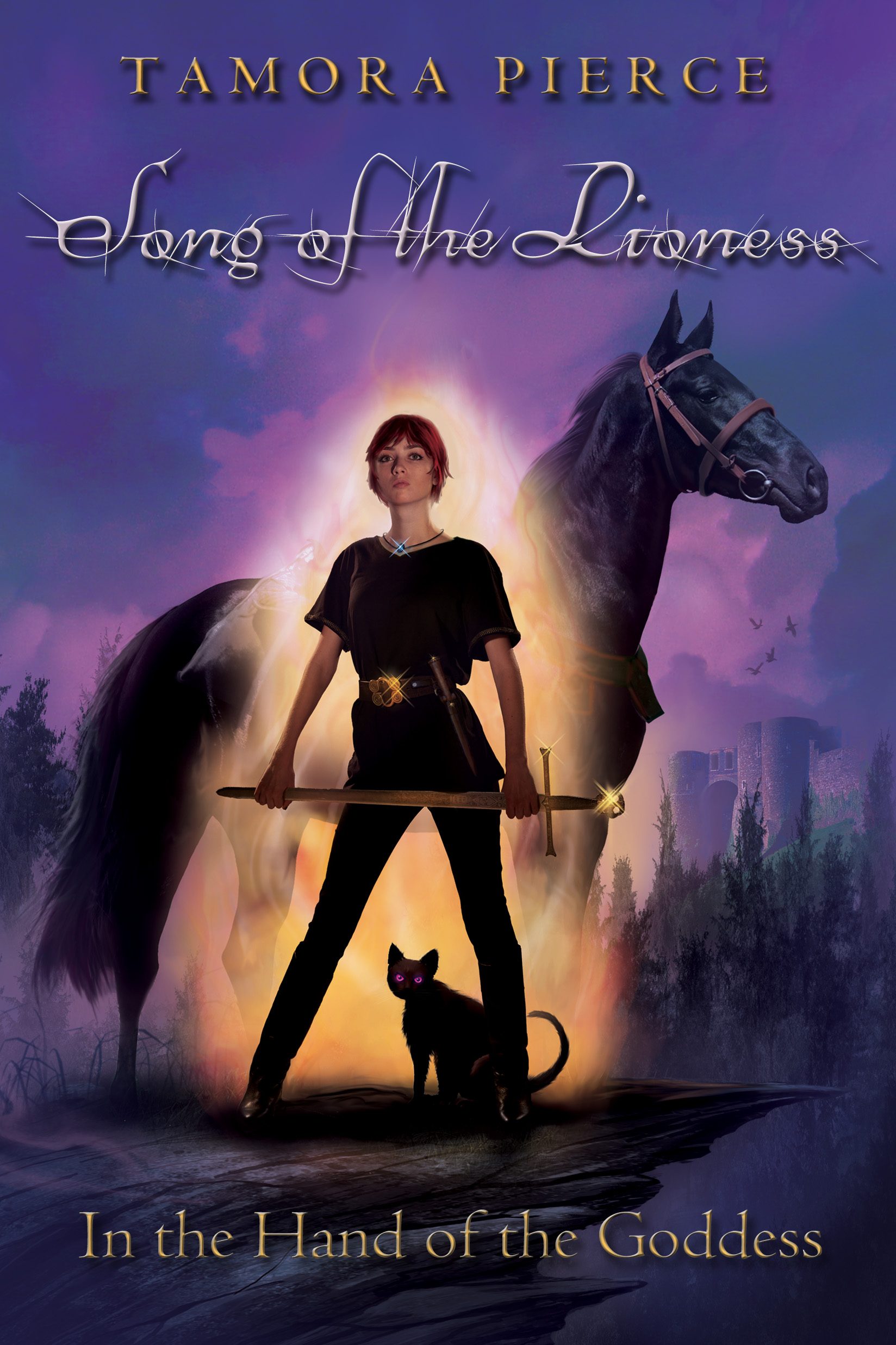
But then, y'all know my take on covers. I like covers that are splashy and pretty and brightly colored and goddamn LITERAL. Like these Alanna covers. Or any of these. That's the kind of book cover that makes me want to read the contents. I'm not so sure I'd want to read any of the books with whatever the hell is going on here.*
Probably this goes along with the simple principle that if you really CAN'T squeeze an exciting and dynamic scene out of your book to put on the cover, I probably don't want to read it. If your cover has someone chucking a spear at a dragon, or flying a spaceship over a mysterious planet, I get pretty interested pretty fast. If, on the other hand, your cover has, say, a pair of shoes and some doodles on it, I will assume your character's head is so far up her own ass that she never manages to accomplish anything interesting at all. The problem, as illustrated above, is when the books that DO have awesome scenes get stuck with shoes or mooning teenagers. Why the hell would you even PUT that on there when you could have somebody do a Drew Struzan-like splash of awesome?
Listen, publishers: unless your book is a picture book, I get exactly ONE illustration per volume. MAKE IT A GOOD ONE.
*I know I've used this comparison before, but I don't care because it's still a perfect one.
Of course, this just brings home to me that most book covers, aside from being gendered as FUCK, are also terrible. I remember getting fairly grumpy as I shelved books at the library: all the male authors got Jackson Pollock ink splats, and the female authors got random fruit, random flowers, or, for some reason, feet. And then of course there's the Angsty YA: dudes get monochromatic silhouettes, and the ladies get monochromatic greyscale soft-focus girls looking thoughtfully away, possibly at the wind machine that seems to be blowing their hair all over the place.
But then, y'all know my take on covers. I like covers that are splashy and pretty and brightly colored and goddamn LITERAL. Like these Alanna covers. Or any of these. That's the kind of book cover that makes me want to read the contents. I'm not so sure I'd want to read any of the books with whatever the hell is going on here.*
Probably this goes along with the simple principle that if you really CAN'T squeeze an exciting and dynamic scene out of your book to put on the cover, I probably don't want to read it. If your cover has someone chucking a spear at a dragon, or flying a spaceship over a mysterious planet, I get pretty interested pretty fast. If, on the other hand, your cover has, say, a pair of shoes and some doodles on it, I will assume your character's head is so far up her own ass that she never manages to accomplish anything interesting at all. The problem, as illustrated above, is when the books that DO have awesome scenes get stuck with shoes or mooning teenagers. Why the hell would you even PUT that on there when you could have somebody do a Drew Struzan-like splash of awesome?
Listen, publishers: unless your book is a picture book, I get exactly ONE illustration per volume. MAKE IT A GOOD ONE.
*I know I've used this comparison before, but I don't care because it's still a perfect one.
no subject
Date: 2013-05-08 05:56 pm (UTC)* And, given the title, that would be the one book where I'd want the cover to show a woman on a horse. Seriously.
no subject
Date: 2013-05-08 06:25 pm (UTC)Also, she is doing Disguise Herself As A Boy wrong.
no subject
Date: 2013-05-08 06:28 pm (UTC)no subject
Date: 2013-05-09 05:18 am (UTC)no subject
Date: 2013-05-10 01:17 am (UTC)no subject
Date: 2013-05-08 07:41 pm (UTC)(Much like movie posters, all the illustrators and artists I know loathe the trend of stock photo + background stock photo + dark, but we aren't in charge.)
no subject
Date: 2013-05-08 07:46 pm (UTC)Funny you should mention movie posters--I almost added that I wish more books had Drew Struzan-type covers. Posters and book covers should not make me care LESS about the books and movies they're selling.
no subject
Date: 2013-05-08 07:55 pm (UTC)no subject
Date: 2013-05-08 08:01 pm (UTC)no subject
Date: 2013-05-08 08:11 pm (UTC)no subject
Date: 2013-05-09 07:25 am (UTC)I also have the Art of Avatar: The Last Airbender. It's magnificent.
no subject
Date: 2013-05-09 07:08 pm (UTC)no subject
Date: 2013-05-09 08:42 pm (UTC)no subject
Date: 2013-05-10 01:18 am (UTC)no subject
Date: 2013-05-09 05:21 am (UTC)Look. You don't write a template story
well you wrote romance so maybe you do. I don't do template 'art.' No.You don't say "All the covers out there are bed! You could do better! BY DOING THE EXACT SAME THING." It just doesn't work like that.
no subject
Date: 2013-05-09 05:29 am (UTC)Of course, that's a lot of work, so we'd have to take it slow.
no subject
Date: 2013-05-09 05:43 am (UTC)I turned in my amended paperwork today, though!
no subject
Date: 2013-05-09 06:18 am (UTC)no subject
Date: 2013-05-08 08:12 pm (UTC)no subject
Date: 2013-05-09 06:32 am (UTC)The copies of The Belgariad and Malloreon I have are like that, too. None of the characters on the covers look like they have anything to do with the people in the stories.
And don't get me STARTED on the mysterious tendency for characters of color to turn white on covers. NO WORDS.
no subject
Date: 2013-05-09 01:33 pm (UTC)This is one of my favorite books - I have this edition and I had to put an opaque cover on it because it is ALL WRONG. I could see some of the inaccuracies in the art as being understandable if it were painted just from the single scene it depicts, but what drives me really nuts is that in that scene, there are repeated instances of emphasis that you CANNOT LEAVE A TORN WING TORN and the requisite stopgap measures being applied. ARGH NOT OKAY okay done ranting sorry.
no subject
Date: 2013-05-09 05:09 pm (UTC)no subject
Date: 2013-05-08 10:04 pm (UTC)But that did get me thinking about Terry Pratchett's book covers, which, up to Carpe Jugulum (it looks like) consist of a chatoic background, the name of the book in a particular font, then then one clipart style image in the center. I compare those to the dust jacket of the very first Terry Pratchett book I read, Men at Arms, http://images.bookcrossing.com/images/journalpics/854/49/8541949.jpg. We got a copy in the mail from some science fiction book club and the only reason anyone in the family started reading it was because we were wondering if the writing was as bad as the cover art.
But then, I got to the Tiffany Aching books, and discovered two things: 1) They really had a change of heart on the cover design between books two and three. 2) Books three and four could have definitely been part of that gender swapped author slideshow.
no subject
Date: 2013-05-09 07:15 am (UTC)no subject
Date: 2013-05-09 02:19 pm (UTC)Now I need to peruse Good Show Sir some more.
no subject
Date: 2013-05-09 02:27 pm (UTC)no subject
Date: 2013-05-09 08:10 pm (UTC)no subject
Date: 2013-05-10 01:25 am (UTC)Kidby is my favorite, too! He seems to strike the right balance of parody and awesome that Discworld is all about.
no subject
Date: 2013-05-10 03:29 am (UTC)